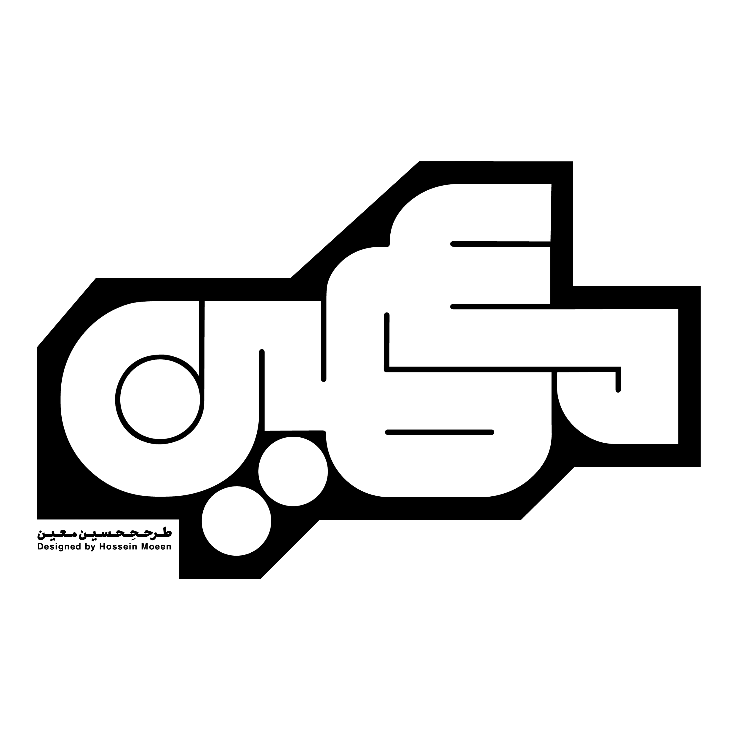
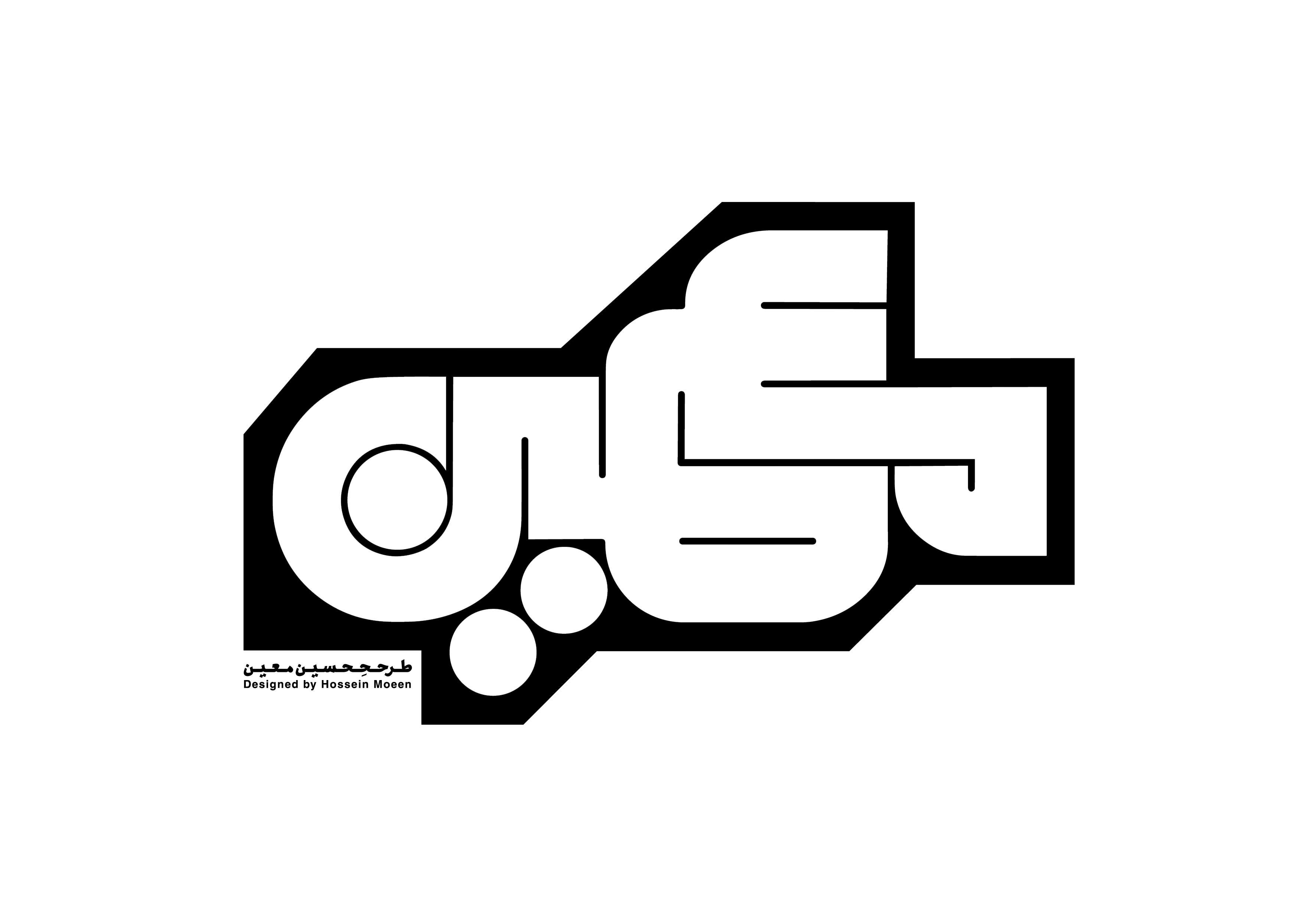
To meet this brief, we developed a complex shape that unifies the “S” and “L” into a monogram. By repeating the outline of these letters, we were able to evoke the texture and feel of wood. Additionally, rotating the logo by 45 degrees allows it to stand on a single point, symbolizing the solid yet intricate nature of the wooden items the company produces. This design choice reflects the brand’s commitment to crafting unique and modern shapes that are both aesthetically pleasing and incredibly useful in everyday life.
The color scheme used in this visual identity is directly inspired by the wooden planks from which these items are crafted in the workshop. This connection to the material roots of the brand enhances the authenticity and warmth of Stanlife’s visual identity, reinforcing the brand’s dedication to quality and craftsmanship.